Proxima HR
ProximaHR is an HR management system that brings employee data, attendance tracking, payroll, and task management into one simple and easy-to-use platform.
Year
2024-2025
What I worked on
Brand designer
Product design
Web designer
The problem
ProximaHR suffered from an unclear layout, no brand presence, and an outdated look. Users found the app difficult to navigate, which led to frustration, slow workflows, and low engagement.
Goal
Build a distinct brand identity and craft a clean, intuitive interface that feels modern, functional, and enables HR managers to handle daily operations effortlessly.
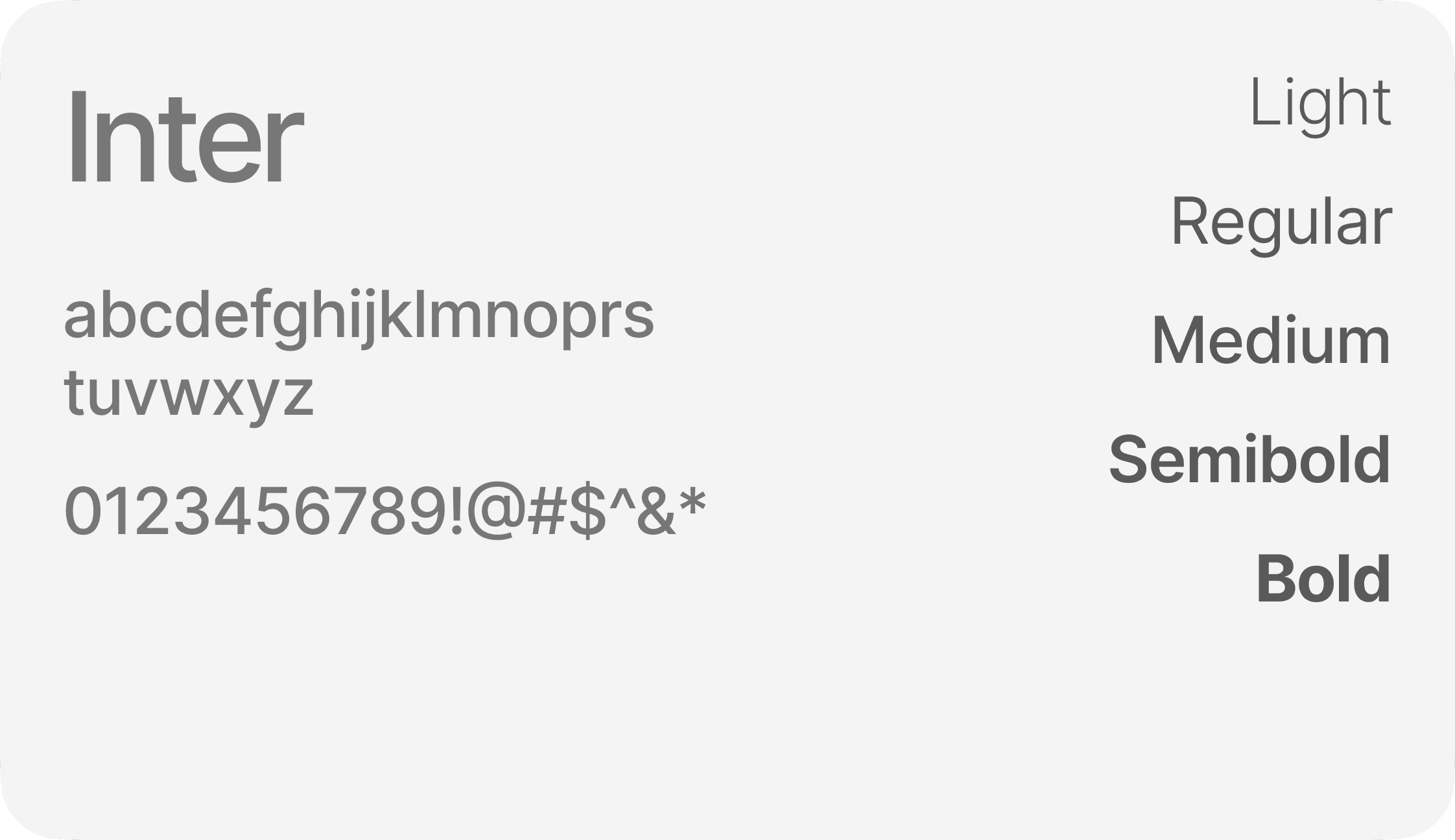
Style guide


Design Craft
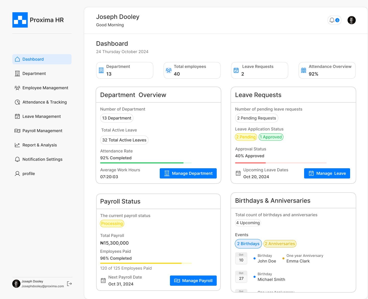
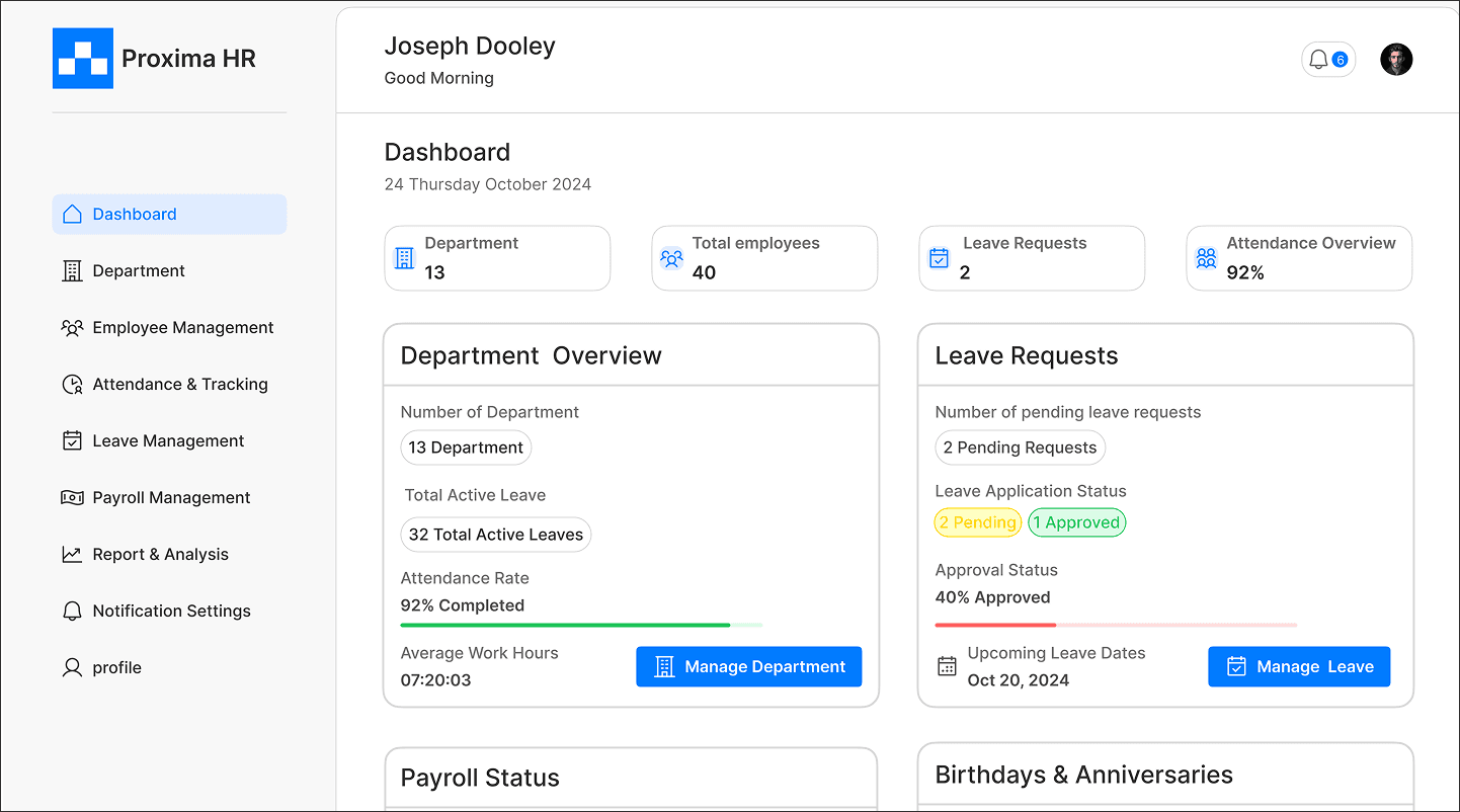
Dashboard
A clean, familiar layout that gives HR managers the essentials at a glance without digging around.

Payroll Management
A straightforward view of payouts and monthly totals, helping managers understand finances faster.
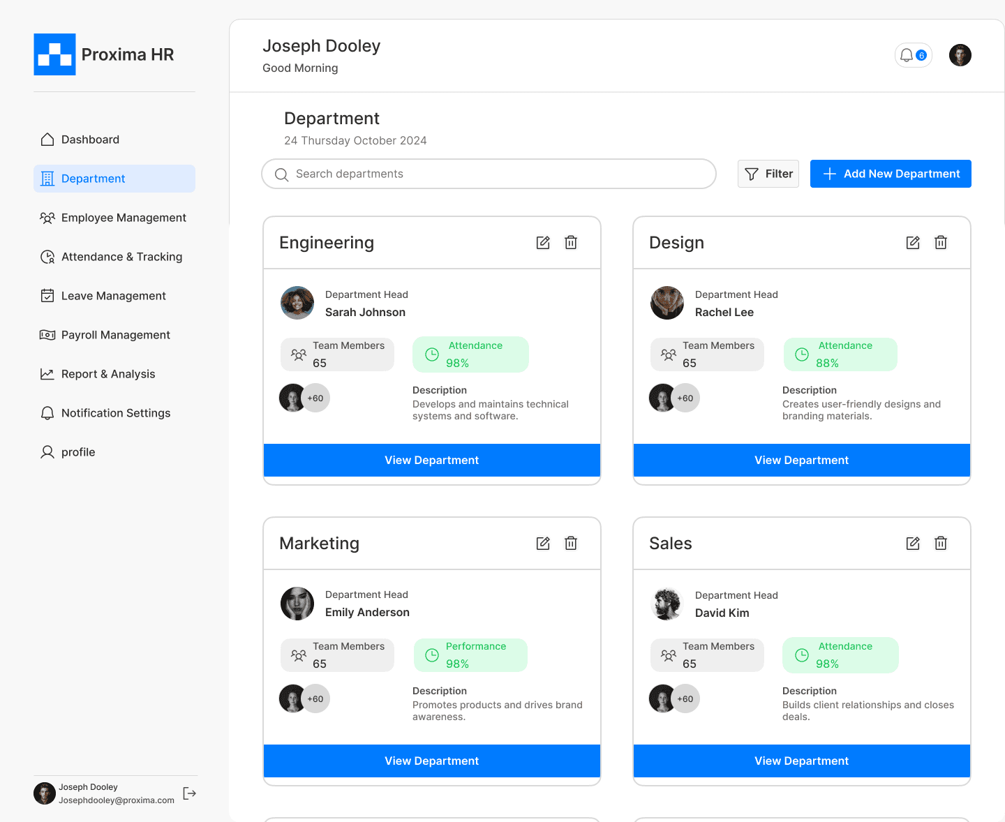
Department
A straightforward view of payouts and monthly totals, helping managers understand finances faster.
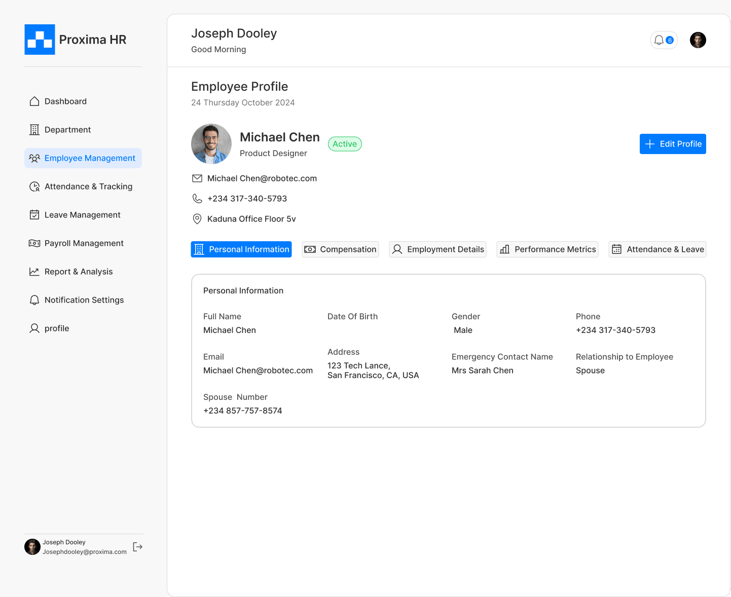
Employees profile
A straightforward view of payouts and monthly totals, helping managers understand finances faster.
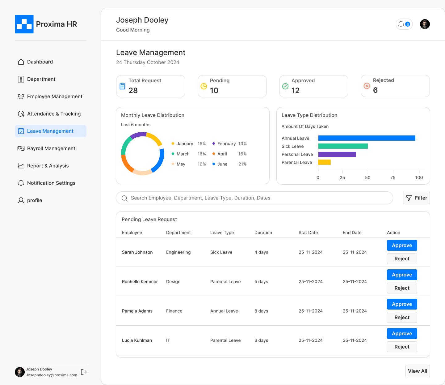
Leave Management
The experience was structured to clearly display pending, approved, and declined requests.Charts and status indicators provide instant at-a-glance metrics for HR decision-making.
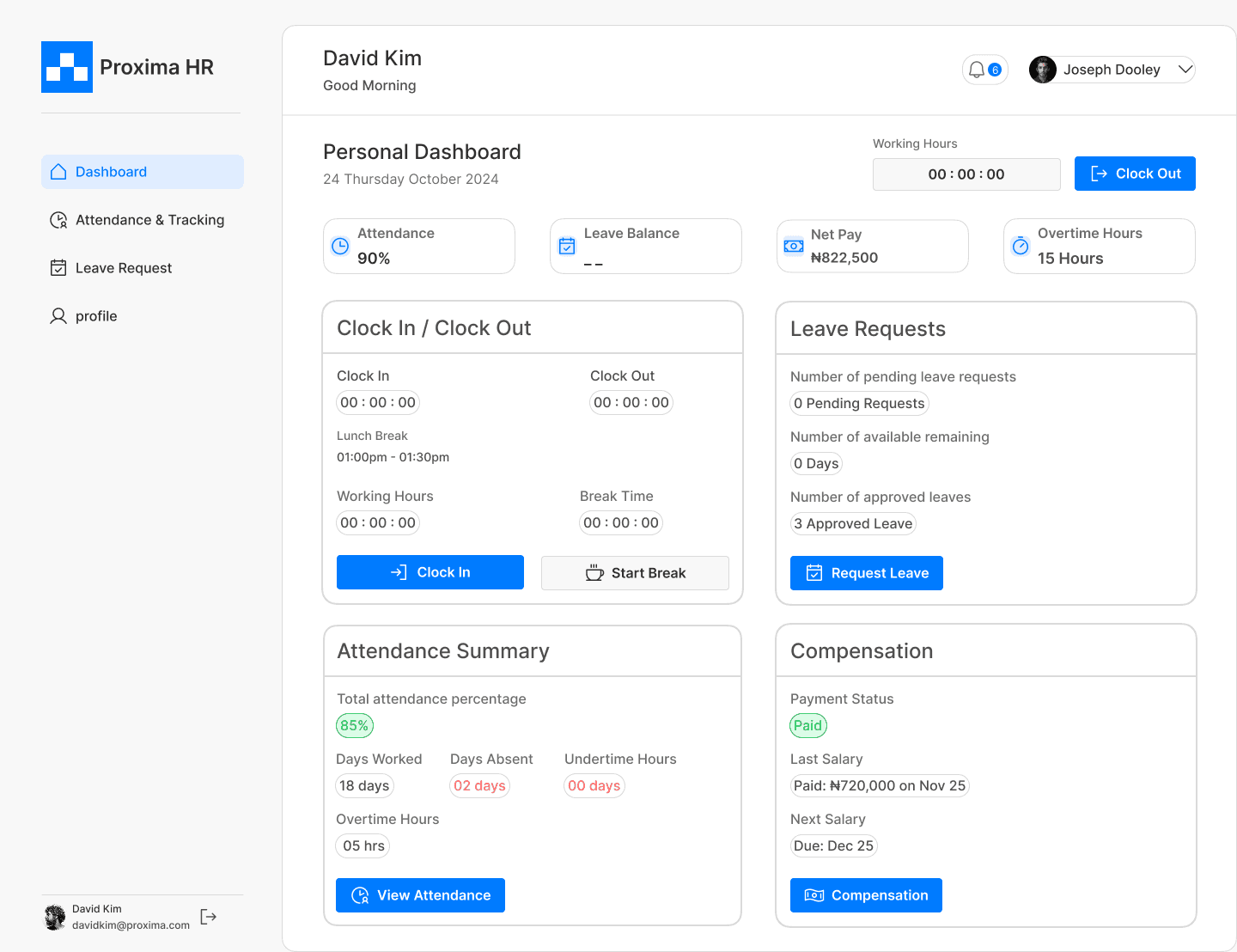
Personal dashboard
A straightforward view of payouts and monthly totals, helping managers understand finances faster.
Leave request
A straightforward view of payouts and monthly totals, helping managers understand finances faster.
Challenges
Creating smooth clock-in/out alerts:
Figuring out how to create a non-intrusive yet effective notification system for employee attendance was challenging and required several iterations.
Limited domain knowledge
This was my first time designing an HR app, so I had limited knowledge of an HR manager’s daily tasks, which created a learning curve early on.
Lack of an early design system
Starting without a proper design system caused inconsistencies and confusion but creating one later helped streamline the workflow.
What I Would Do Differently
Invest more time in research and pattern analysis.
I would deepen my research phase to better understand industry-proven design patterns before making key decisions.
Establish a well-documented design system early.
I would prioritize creating a when documented design system to ensure consistency and scalability across the project.
Explore more design variations.
I would create more iterations and concept explorations to broaden the solution space and arrive at a more refined, effective outcome.